Showing posts with label Sherwin Williams. Show all posts

Saturday, January 22, 2011

Change is good! Or, one transformation leads to another ...

Change is good, for people and our spaces. In this particular case, my client (and friend) wanted her living room to feel warm and comfortable. She wanted people to want to come into her already beautiful home, sit down and stay awhile. A previous remodel had improved upon "builder white" flat walls with a three-color glaze. Everyday sheetrocked columns had been covered in tumbled marble tile.

Ten years later, my client wanted to warm it up. She had purchased new, comfy furniture, and built-in shelves on either side of the fireplace had been replaced. There was a new mantel and a generously sized TV over the fireplace. Yet, the frosty walls and cool gray tones of the columns were killing the comfy vibe.


New oversized furniture and rustic lamp
with a linen shade are much more casual.


To begin the transformation, I suggested we bring down the 12-foot ceiling with a warm-toned metallic plaster. A new scaffold I bought myself for Christmas amazingly straddled this enormous sofa so I was able to work on the ceiling without moving the furniture out.
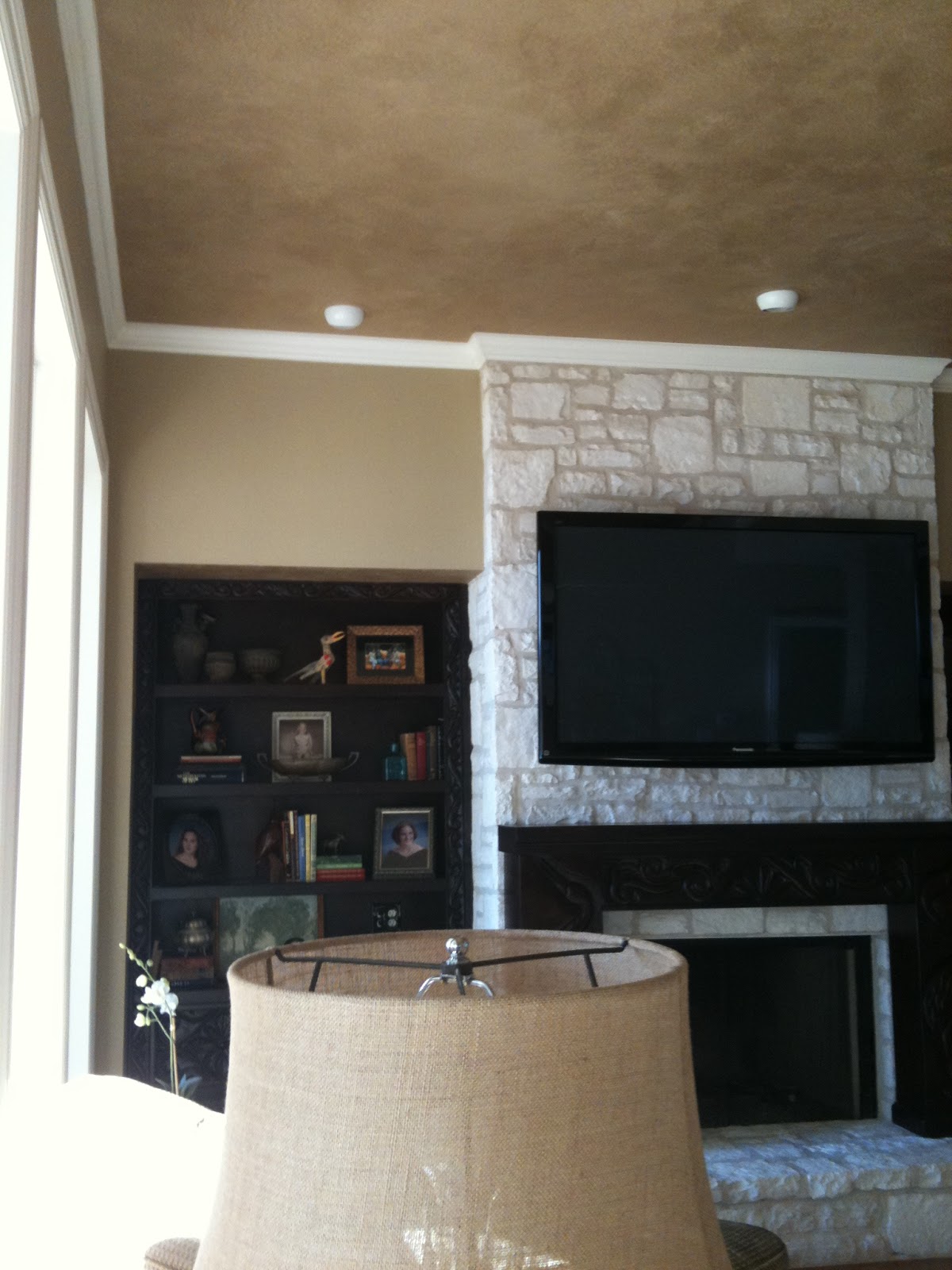
New ceiling is Antique Parchment Lusterstone,
a product from Faux Effects.

But as you might imagine, one project leads to another. And for me, that's not a bad thing. The ceiling turned out so warm and wonderful that my client wondered whether the walls were crying out for a warmer paint color. No problem. We needed to work with the new sofa, and the new ceiling. I didn't even flinch when I painted over my original 10-year-old glaze job with plain old vanilla paint in an eggshell finish. It's Sherwin Williams Basket Beige, to be exact. It blends beautifully with the Antique Parchment Lusterstone, and the sofa, but isn't matchy-matchy. Beautiful white crown moulding defines both perfectly.

After all this beautiful toasty transformation, the columns that had been wrapped in tumbled marble tile stuck out like ... well let's just say they needed a little help, in the form of a wash.

The columns before. Nice, but too cool.


A tinted Lime Wash solved the problem.
It dries lighter.  


The columns now blend in beautifully. And yes,
the white ceiling fan is on its way out. 


The change has been amazing and provides a perfect example of what I love most about what I do ... a completely transformed space and a finite sense of accomplishment. Although, from what I understand, the blue walls in the kitchen are now screaming for something warmer ...

(to be continued) 

Monday, July 6, 2009

I'd like to thank God, and Betsy, and Ryan, and my guts


...


Remember the ugly duckling that was missing a porch or any sort of proper entryway?? Of course you do ... because I'm forever talking or blogging about my favorite place on earth all the time. My husband says I can work Marathon into any conversation. I would be offended if he wasn't right.


Anyway, the picture above is the before picture, on a good day when it was snowing. And the pictures below are the after. I never thought I'd ever see the day when the outside of the house looked as good as the inside.


This is the after. Well, sort of. We're still working on it. New roof. New windows. New paint. I cannot express the feeling of accomplishment.


See the one and only decorative architectural element on this house? The little triangle? Well, I spent all day Sunday painting all that. Yikes. I also forgot sunscreen for some odd reason so I'm looking a little tan and crusty. My hair is getting redder by the minute.


Did you notice the interesting cedar porch? ... I'm not even going to start bragging on my husband again. It's getting old. He doesn't want people to start hating on him once they understand his brilliance and perfectness. OK, yeah, he's still a man and annoying and I don't want him getting the "big-head."


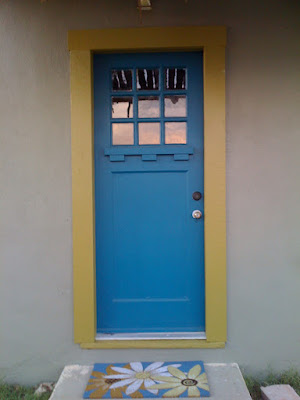
Can you believe this front door mat? I bought it at Tuesday Morning for $9, not realizing it would be the most perfect, matching doormat ever. The blue is perfect. The yellow/gold blends as well. We originally had grand visions of building a new front porch, with flagstone. And then we got realistic and decided to keep the regular, old step. It gets you in the house. And it was free. I love the front door.


OK, let's all flash forward and imagine my Academy Award winning moment: "I would like to thank first, my husband, Ryan, for insisting on the main body-of-the-house-color, SW Crater Gray, when I was waffling toward some safe earthtone. Thank you hunky man in Castroville who told me the name of the paint of his house when Ryan made me get out and go hold my paint fan up to the house...


"And thank you, world-famous Abbey Branch, for suggesting an interesting blue for the doors and windows as a Southwesty homage. Once we got new windows we couldn't paint them blue. The color is Sherwin Williams Oceanside. It's awesome, even though there's not an ocean anywhere near here. Good thing because I'm not a fan of oceans. I'm a mountain girl.


Before the music starts playing to scoot me off the stage, I'd like to thank myself for having the balls to paint the trim Sherwin Williams Brassy. It's avocado-ish, and limey, and gorgeous. Somehow it's perfect. Thank you, my husband, for not being a metrosexual freak and second-guessing me. Thank you, Mom, for not voicing your doubts, and being patient until it all came together.


In the words of Joe Danner in 1983, it's "fannnnnntastic!!!"

Wednesday, June 10, 2009

In praise of 6-hour car rides, handy husbands & wild West Texas storms

My name is Sami and I am addicted to West Texas. I have many issues. You might remember in March I developed a new cloud neurosis. Today on our way home from our 24-hour trek to West Texas and back, Ryan pulled my nose out of my magazine to point out some seriously ominous clouds.


I immediately reached for my camera, and then proceeded to get all wiggly and freakish when the pictures turned out really great. I could not wait to get home and share them with the world:


I saw the clouds above first. Check out all the variations of dark bluish gray, and that one little white puffy cloud.

The following clouds were to the left of our car. I'm saying these would be to the north ... For at least 50 to 75 miles, we drove right alongside this storm system, which kept nicely to itself on the left.


Over to the right, pretty whitish clouds and blue skies.


This exit sign shows all you other West Texas freaks right where we were. I captured this picture rolling along about 85 mph... Pretty good huh? Now you see why I was getting all wiggly and freakish.

Every so often, we had some good lightning, so the storm could show us it was serious.


Did you realize you can be a cracker-jack mortgage guy, talk on the cell phone, and drive through storms on I-10 and make your wife really, really happy with 24-hour treks to West Texas? Who says men can't multi-task? Cell service on I-10 is greatly improved! Back in the day we lost service in Kerrville.

Some people think we're nuts for going on long 6-hour trips to West Texas together, but can I let you in on a little secret? This is the only time we get to think, plan, talk and strategize about our life, our marriage, our kids and careers. The rest of the time we're just making it through the days. Moral of the story: trap yourselves in a car for six hours and see what happens.

OK so then, I turned my attention to what was going on behind the car. Dork alert! The wind was blowing pretty hard, which is normal even without a storm because this is all in the vicinity of the wind farms.


And now for the object of all my affection, and the destination for our 24-hour West Texas trek. See that hideous aluminum window to the left of the electrical boxes? Well, it's going bye-bye. We had to go out there and get good measurements for the new windows! The house is set to get its new paint job in July, and efficient husband doesn't think it will be efficient to paint the whole house and then later rip out the windows and then put up new trim and repaint the trim. He has a point, and since I got to go to West Texas, I was an enthusiastic supporter of his plan.

Notice the beautiful blue paint color Abbey Branch (the famous designer) helped me select. SW Oceanside -- I love it. To the right of the hideous brown, wood-rotted trim board, you can see the future paint color for the body of the house -- SW Crater Gray.

And while you're admiring the door, did you spy the fabulous landing/mini-deck my super-handy, hunk of a husband built a few months ago? If only I could show you the previous way you got into the house. Let's just say it involved a homemade step and a wooden pallet. Very classy.

Life is good, y'all.

Thursday, February 5, 2009

Visualize this: In praise of the Sherwin Williams Color Visualizer

Do you love it? Do you want to marry it?

I love the Sherwin Williams Color Visualizer. It is so much fun to click and drag colors and see what you can come up with. It also will suggest colors for you, which is pretty handy because it will offer suggestions you wouldn't think of yourself.

You know I've been contemplating (obsessing, actually) about exterior paint colors for the Marathon, Texas, retreat house. It's what I do. I think about paint colors. And then I also think a lot about that house. The poor thing has been quite neglected through the years. We have been lovingly encouraging it to be, if not a swan, then at least a really cute duck. The energy there is restorative. The view is magnificent. One day I hope to have other people enjoy and restore themselves there. Here's what it looks like now:

Well, I doubt it's snowing right now, but you know what I mean. One day soon it will get a new front porch and a little overhang over the back door -- and a new paint job, ASAP!!! I know, it could use some new windows but that's another project for another day. The goal here is to get the house to visually acceptable.


On the top photo, I was playing around with the Color Visualizer. I used my personal favorite, SW 6410 Brassy, for the trim. The Color Visualizer actually suggested SW 6496 Oceanside for the door and I have to agree that it's quite dramatic, especially given the Southwest blue-door tradition.

To check whether I was out of my mind with the Brassy choice, I enlisted Abbey at Design-Block to help me. She knows West Texas and I'm sure those in the know would say her design aesthetic is quite sophisticated -- whatever that means. I'm from Alpine.

Abbey suggested some other options:

This one has SW 6951 Cote d' Azur for the trim and SW 6607 Cherry Tomato for the door. All of these use SW 6165 Connected Gray for the base color, although the real selection is SW Crater Gray from way back in the day old skinny fan. It's still really similar to Connected Gray:

Pretty cool, right? But something makes me feel like it's a little too whimsical and cartoonish. I keep thinking Minnie Mouse is going to come out that door. I don't want the house to just stick out and stop traffic. I want it to stop traffic but in a more subtle way.


Ooooh! This one really blows my skirt up. Here Abbey suggested SW 6477 Tidewater as the trim color. And the Color Visualizer offered up SW 6342 Spicy Hue for the door. It's a toss-up. This one is probably the safer, less edgy option. It would be my second favorite, for sure.

Let's also mention, because I know you're thinking it: The house on the Color Visualizer is just a wee bit more visually appealing than the poor little thing sitting out there all by itself in Marathon. Very true, but let's just say you get what you pay for and they don't even have anything close to that adorable in Marathon. So we're working with what we have, such that it is.

So what do you think?

Sunday, November 23, 2008

We were driving down South Alamo Street in San Antonio the other day when I noticed this grand house for the first time. It must be the new paint job that did it because my eyes had never beamed in on it before. Apparently it is a bed and breakfast, in the heart of the King William district. "Wait!" I shrieked. "Did you see that house?"


Ryan had not noticed it, because he doesn't care about paint colors and, to be fair, it was almost dark. "Oh my gosh!" I said. "That house color combination was fabulous. Maybe we need to paint the Marathon house like that," I continued in that rapid-fire, wheels turning a thousand miles an hour way that I do when I get all flitterbated about something exciting, like paint.


"I thought we had already decided what to paint the Marathon house," Ryan said. Poor thing, he thought this subject was behind him. What he doesn't realize is until it's painted, the decision is never final. And, really, that's what I love about paint. It's never permanent. It's always changeable. I wonder what that says about me, from a psychological standpoint?


Anyway, I need your help. Do you like it? Do you hate it? Here's another view of the house that cranked my head:


I just love the crisp white against the warm tan, and the black sets it all off so nicely. Is it too formal for the Marathon setting?

Here's a picture of the dingy outside of our humble home in Marathon. It really needs some help:

This is how it looked the day we went to do the inspection. The evaporative cooler is out of the window and it has a new tin roof. The storm screen doors are off. And there are a few plants trying to grow in the yard. But other than that, it's still aching for some curb appeal. A new porch is planned to jazz up the front entry, and a little overhang is going over the back door, but those will have to wait until people can qualify for home mortgages again. (Shameless plug: www.accessmortgageplanners.com.)

The former option for this quaint little West Texas diamond in the rough was Sherwin Williams Crater Gray, which Ryan loves. I love the color, too, It's a gray/green/bluey color and quite masculine and cool. We first saw it on a beautiful house in Castroville. The difference that gives me pause is the Castrovile house sits in the shade, surrounded by beautiful green trees. This house sits out in the arid plains, set against tan, dry desert mountains. I do not want it to stick out like a turd in a punch bowl, as someone really influential in my life named Bob used to say and probably still does.

So what do you think? If you're one of those sneaky people who reads this blog and doesn't comment, please break that trend today and tell me what you really think!

Monday, September 8, 2008

The bathroom wall I'm currently in love with

My most favorite recent faux application -- lucky for me -- is in my very own bathroom. Philosophically, I'm really not into making something look like something else, which I guess what faux painting is supposed to be, after all. For some reason it makes me think of something my grandmother used to say: "You can't make a silk purse out of a sow's ear."

While Mama was referring to "common" people without breeding or good manners, she hadn't yet seen some of things we can do nowadays with good painting materials and plain old sheetrock walls. Please let me whisper that our family can only claim manners, alas. And some of us don't do so well with those either.

Anyway, back to my favorite wall. Its basecoat is Sherwin Williams Blonde, which is a pretty great color in a light-filled house. I can be a little muddy in a dark little room without much natural light. Then, I used Faux Effects Lusterstone colors Antique Parchment, Silver Moss and Charred Gold. But my favorite part is the white, which is Faux Effects Fauxstone Pull-Off. That's my favorite product ever.

Sorry. This photo is a little blurry because I was trying to take the photo without a flash, in natural light. Still, you can get the idea.


I really love how how the Antique Parchment catches the light and looks gold. I did a similar application in a house on Treasure Island, in the middle of Lake McQueeney. Remember this?

This is the house with the sexy sink. I didn't do a very good job taking this photo and it looks a little blotchy, which it didn't in real life.


Now I need to go see about being a faux mother and cooking some real dinner.

Tuesday, February 26, 2008

Love it, love it, love it!

It's really hard for me to turn off my brain sometimes at night. And since I've been up painting on Vicky's coffee table because she's having a CAbi party on Thursday and MUST have it and I PROMISED, I can't dive into creative brain buzz and then shut it right off like someone else I know in this house.

With that in mind, I decided I'd blog for a bit. We've all been a bit blogless lately and I've nothing to read. Since I don't really have anything profound to profess at the moment, I decided to show y'all a house I really like. It's on Lake McQueeney, on Treasure Island. I had noticed it for its special, not-the-same-old-Sherwin-Williams-neutral color. However my very cool friend Stephanie one day said "have you seen the cool house with the pink shutters?"

Pink shutters? And I had not seen this and taken note of it? The very next day I was out on "the island" (as we like to say in a Thurston Powell voice) so I decided to track it down. I still love the house, but with the pink shutters installed, now I want to marry it.

If I was to put shutters on my house and be as avant garde, I suppose they would need to be lime green, or a boring black. I can't seem to find a picture of it on this computer, so I'll have to show you next time.

Here's a peak at the house I love from the water.


For a lake house, I just love it.

Wednesday, February 13, 2008

Are you a picker? Or a grinner?


For the last two weeks, I have been transforming kitchens, both previously hidden by hideous wallpaper, circa 1992-ish. I think I mentioned the first job. The baby blue flowers on white with dusty pink hearts was an exhilarating joy to pull off. It came off in sheets, so it was fast and easy. Just like I like it.

I've since moved on to my next victim. This particular wallpaper was put on a bit more professionally, in a truly custom home, so my guess is they used the right glue and wanted it to stay on. And then subsequent homeowners tired of the dusty pink with southwesty green brush strokes. People are so fickle, aren't they? They first painted over the wallpaper with a Pepto Bismoly pink. And then something we're calling "custom-mix mauve." Oh, the horror of it all. Painted Groove to the rescue.

Here's a picture of how the wallpaper started lifting off. This is why the husband agreed to let me come in to do my magic.

Let's just say that this removal job is more like cleaning teeth than it is creating a beautiful custom finish with all my incredible talents. I told Lavenderchick I feel like a dental hygienist. She was kind of jealous, being a picker and all.

I'm actually working up a sweat getting off some of the paper, along with two or six coats of paint. It's really tedious but for some reason I totally dig this kind of thing. The transformation is going to be spectacular. This is how the walls are going to look when they're finished. This photo is from the powder room nearby. The basecoat will be the same, SW Nomadic Desert, but I plan to skip the metallic glaze in the kitchen.


Friday, January 11, 2008

My Most Recent Favorite Thing


Abbey from Design-Block reminded me that I need to post more pictures of my work. Since that is relatively easy and I have a few pics already downloaded, here's a picture of one of the most favorite projects I completed all year.
I really can't take the credit for it. Jeff and Nancy of Jeff and Nancy Inc. actually came to me with the concept. The design is similar that of a delicious duvet they installed in a job somewhere outside the little old town of Seguin. You know, the town with the really big pecan on the courthouse square. Bryan Duckworth, formerly Robert Earl's fiddle player, has written a darling song about it called The Big Pecan.
Getting back to the dresser, I just made myself a stencil and then hand-painted it onto the dresser. I'm thinking it may have been easier with the image projected onto the dresser, but I was in a time crunch and couldn't quite figure out how to get the pattern from the duvet to a transparency sheet. The other small problem is I don't have an overhead projector. So if you know how I could have done this better and more efficiently, do share.
Jeff and Nancy are some of my most favorite designers because they aren't afraid of color and seem to have an above-average slew of lovely clients. When I met them I was super-sick of Sherwin Williams' neutrals like Macadamia, Practical Beige & Sands of Time and they've been wowing me with colorful selects ever since. Go to their website and you can see more examples of jobs we've done together. Not all of them involved me, of course.
The vibrant green I selected is Sherwin Williams Verdant 6713. I'm sure I've mentioned it before. It's my favorite new green, besides Antiquity 6402. If you go to http://sherlink.sherwin.com/swapp/color_visualizer/ you can look these beauties up and take a look for yourself. I still haven't figured out how to insert paint chips into my blog.
So there you go. Tune in tomorrow for info. from my week at faux college.